Projects 🖼️
Five case studies. Each card pairs narrative context with the actual key visual or mock-up.
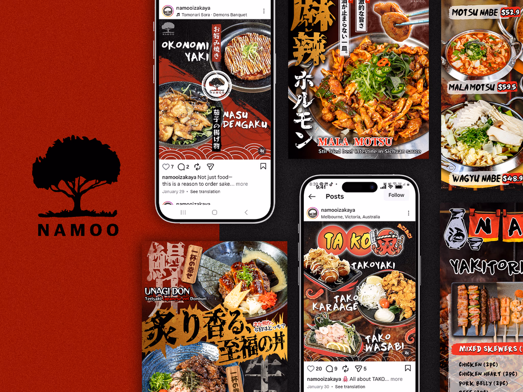
Problem
Brand tone shifted between menu, social, and print, so the in-venue experience and online presence felt disconnected.
Process
Locked logo type, palette, and graphic motifs into one kit, then built layout grids menus and promos could reuse.
Outcome
Touchpoints spoke in one voice, so recognition felt tighter across channels.
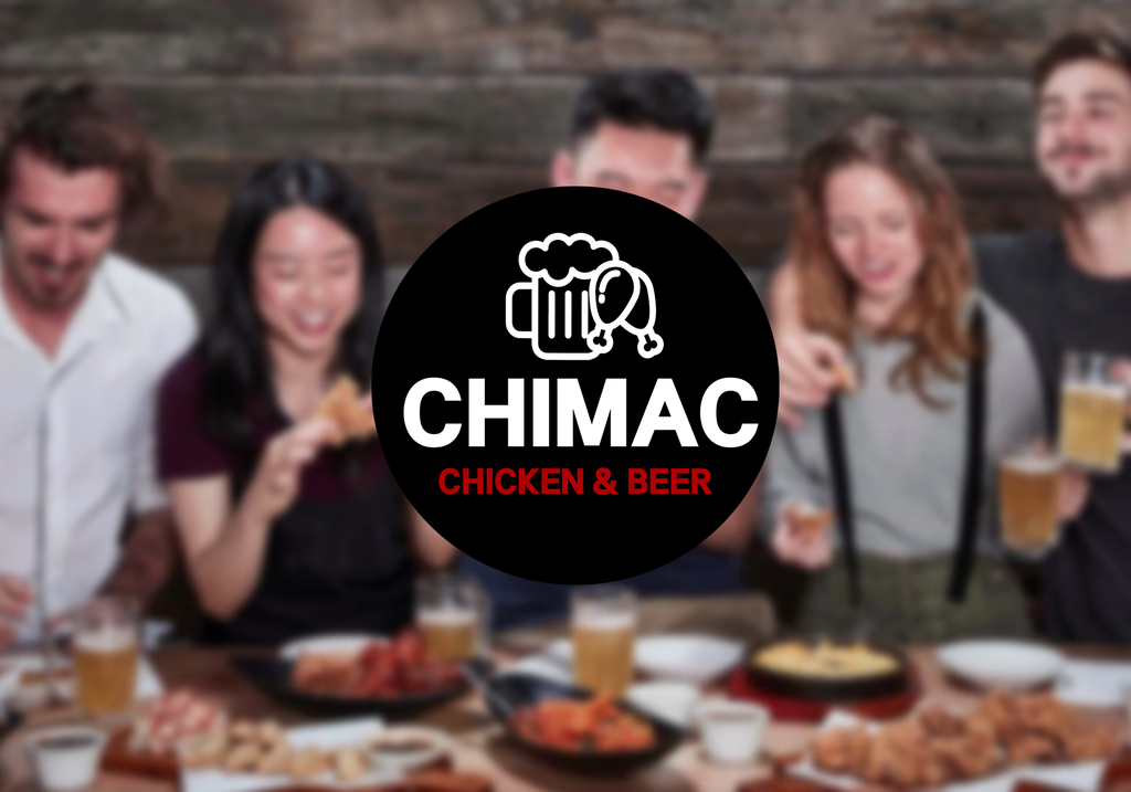
Problem
The product had appeal, but packaging and posters jumped in tone each season, so every launch needed a fresh explanation.
Process
Fixed hero colours and illustration style, then patternised hierarchy between headlines and product photography.
Outcome
Reusable asset structure sped up production while keeping campaigns coherent in venue and online.
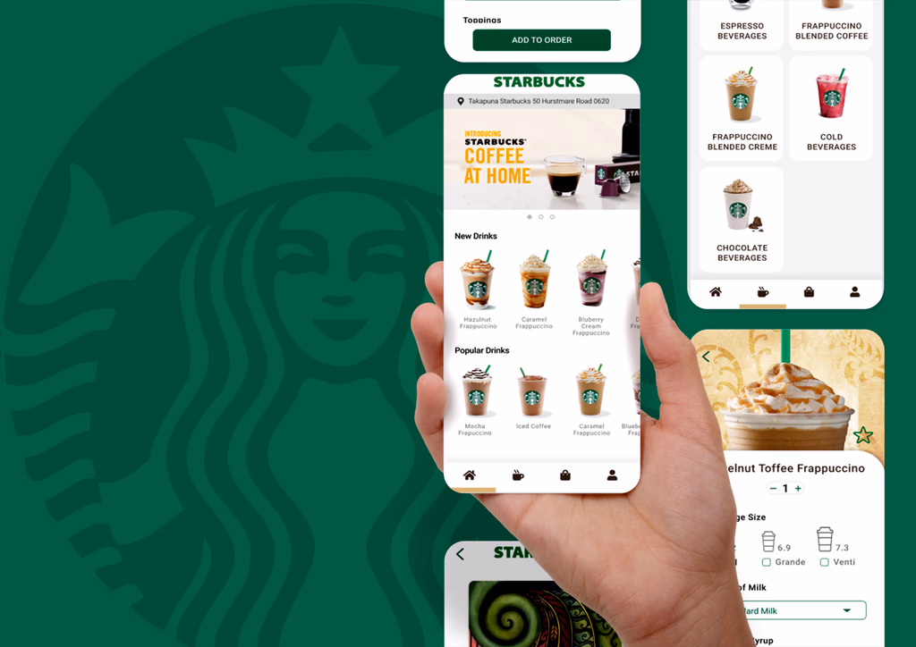
Problem
Features were plentiful, yet common flows (order, store, rewards) didn’t scan clearly on first open.
Process
Scenario-first wires, then tightened type, spacing, and colour so screens were easier to scan.
Outcome
UI mockups explore a lower-friction direction. Not affiliated with Starbucks; this is a personal study piece.
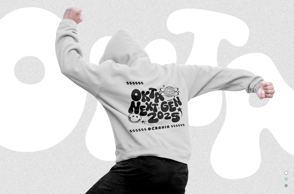
Problem
Mixed announcements and programme notes in one channel diluted a confident event identity.
Process
Shared poster, banner, and social card grids with consistent ratio rules for photography and type.
Outcome
Aligned on-site and digital tone so attendees could follow information quickly.
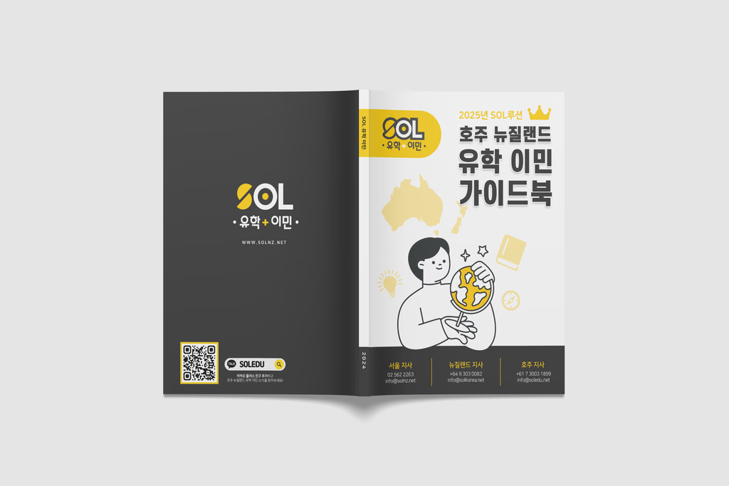
Problem
Readers felt overwhelmed when law and process landed all at once with no obvious starting point.
Process
Step-based sections, boxes, and icons on a regular rhythm so checklists surfaced first.
Outcome
Proposed a print guide with a layout system readers can return to over time.